News in Brief
Dairy Farmers of Canada new logo launch aims to reinvigorate Canadian dairy sector
"Every organization at some point needs to update their image, and it had been over 20 years," Isabelle Bouchard, communications and government relations director at DFC, told DairyReporter. "And it was to get consumers' attention too, because people get used to seeing logos and at a certain point they don't see them any more."
Stronger brand recognition and differentiation for Canadian dairy sector
The new logo, designed by advertising agency DDB, features a cow and “Dairy Farmers of Canada” written in English on top and French on bottom in a lighter blue color is a more “eye-catching” design that communicates a stronger, more optimistic and authentic brand identity, DFC said.
The reason DFC chose to go with a lighter blue had to do with the whiteness of milk, which communicates purity to the consumer.
"Milk is so white, that it sometimes looks blue," Bouchard said. "Blue has always been the color of Dairy Farmers of Canada because of the whiteness."
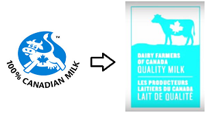
Unlike its former logo, the new logo features a more realistic depiction of a Holstein cow bearing Canada’s national symbol, the maple leaf. The new logo also includes the words “Quality Milk,” intended as a pledge to customers that the product is made with 100% Canadian milk and Canadian dairy ingredients.
These design elements are meant to help Canadian shoppers more easily identify DFC products in the dairy aisle and better represent the country’s dairy sector.
Why English over French?
The new logo depicts "Dairy Farmers of Canada" on top of "Producteurs Laitiers du Canada," a choice that does not convey preference for one language but rather is meant to represent the French language being the "roots" of DFC. It was also a practical design sizing choice, according to Bouchard, since the English version is smaller, contains fewer letters, and makes for a more balanced logo.
DFC will be launching a transitional campaign to explain the change of logo to consumers.
"It will be a slow transition for the next year and a half, but I expect to start seeing the logo on the shelf by the end of the year," Bouchard added.