The study confirms the importance of packaging design in influencing health-related taste evaluation but “clearly shows” how such effects are highly dependent on the context.
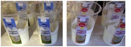
Dutch shoppers in hard discounter Aldi and organic supermarket Ekoplaza were asked to evaluate two identical yoghurts, one in a red packaging and the other in green and blue.
There was a “significant effect” of packaging on Aldi shoppers who perceived the green yoghurt pot as healthier compared to the red one, and this led them to believe the product was healthier. However this did not affect the overall tastiness of the yoghurt.
For the Ekoplaza shoppers, however, the different packaging colours had no significant effect, nor were health or hedonic taste evaluations affected by packaging design. The Ekoplaza shoppers were also more critical of the yogurts’ taste and packaging overall compared to the discount shoppers.
The researchers argue that shoppers in green supermarkets are more aware and critical of healthiness perceptions induced by packaging and so are less easily persuaded.
"Our findings attest to the importance of packaging design for food perception and taste evaluation, However, at the same time, they warn against overgeneralizing findings from one (environmental) context to another, and stress the necessity to carefully consider store characteristics and (related) shopper concerns,” they write.
“Arguably, in a green environment, products are considered similar in terms of healthiness, whereas in a discount environment, variations between products in terms of healthiness are much larger, leaving more room for perceptions to be influenced by packaging design.”
Previous research has shown how even typeface and layout of certain design elements can contribute to the healthiness perception of a product. Graphic elements such as arrows or swirls that point upwards led participants to perceive laundry detergent as fresher compared with downward pointing elements.
“Arguably, natural, healthy products may benefit from an upward orientation, as healthy foods are more readily associated with a lightweight character [such as] being low on calories and easy to digest,” write the authors.
The study
Fifty-three shoppers at Aldi were approached at the checkout and asked if they wanted to take part of a taste sampling trial for a fictitious yoghurt brand, and were randomly assigned to either the green or red packaging groups.
Before tasting the yoghurt, the participants filled out a questionnaire asking “This package suggests that this is a healthy product”, “This package
suggests that this is a responsible product”, and “This package suggests usage of natural ingredients” while after tasting they were asked to indicate

to what extent the following taste terms - pure, fresh, natural, healthy, wholesome and honest – applied to the yoghurts and, to evaluate hedonic perception, whether the yoghurt was tasty.
“The results presented might be taken to suggest that shoppers in the ‘green’ environment were much more attuned to product healthiness and therefore unsusceptible to subtle, visual packaging elements bearing no direct relation to packaging contents and healthiness thereof.
“An alternative explanation would place emphasis on the purchase setting. Perhaps shoppers in a green environment expect [fewer] differences between products in terms of health connotation, precisely because store positioning and ambiance stress healthiness and related constructs to begin with.
The researchers suggest that future studies focus on how store type characteristics, such as ambience, image and point of purchase materials connote a green image.
Source: Food Quality and Preference
“Healthy package, healthy product? Effects of packaging design as a function of purchase setting”
First published online 9 June 2016, doi:10.1016/j.foodqual.2016.06.001
Authors: Thomas J.L. van Rompay, Florien Deterink, Anna Fenko