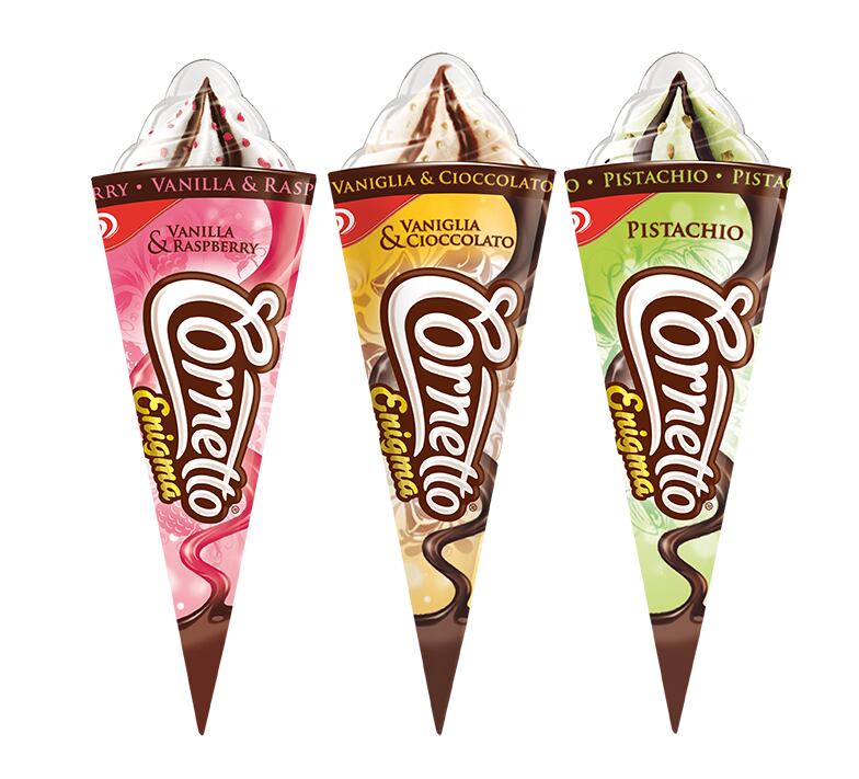
According to London-based design company, Carter Wong, Unilever commissioned the rebrand in an attempt to shake off its “seasonal, out of home treat” image. It hopes the reinvigorated product will appeal consumers as “something to enjoy at home and share any time of the year.”
Cornetto’s Classic and multi-pack single cones have been gifted a new colour code-based packaging design that “give a visual indication of the flavours” – blue for vanilla, red for strawberry, brown for chocolate, green for mint.
A new “innovative” Mix-Mini pack has been introduced on the back of the review, and Cornetto’s premium Enigma range has also been given a design refresh.
The whole Cornetto range will be marketed under a new slightly suggestive strap line – Enjoy the ride, love the ending. According to Carter Wong, the rebrand and redesign gives Cornetto a more “youthful appeal, aimed at a 14-25 year-old market.”
“Easy-to-recognise” logo redesign

Commenting on the packaging redesign, Carter Wong said that the visual changes to the iconic cones began with a “complete re-design of the Cornetto logo.”
The new logo mimics the shape of a Cornetto cone – starting with a large C and tailing off to the O. According to the designers, this adjustment makes the logo “more playful and ‘less corporate’."
“The new logotype ‘owns the cone’ as it would on a chocolate bar, to become the main graphic element and primary interface with consumers. The easy-to-recognise graphic nature of the word mark avoids language issues, much like the ubiquitous Coca-Cola logo,” said Carter Wong.
According to Carter Wong, this redesign should help Unilever “reposition” the Cornetto brand around the world.
“The rebrand gives the product a more youthful appeal, aimed at a 14-25 year-old market,” said a statement from Carter Wong. “The visual changes signal and support a range of innovations in the product and product range that will reposition the brands worldwide.”
“The new brand design addresses key issues related to the global reach of the brand. It takes into account language differences, the variable printing capabilities of countries, and most importantly brand recognition.”
DairyReporter.com contacted Unilever in regards to the re-branding and packaging re-design, but no reply was received prior to publication.
